CLIENT FOCUS: Puckett's Grocery & Restaurant
Click image to enlarge and view gallery.
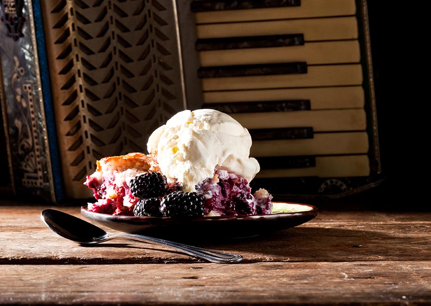
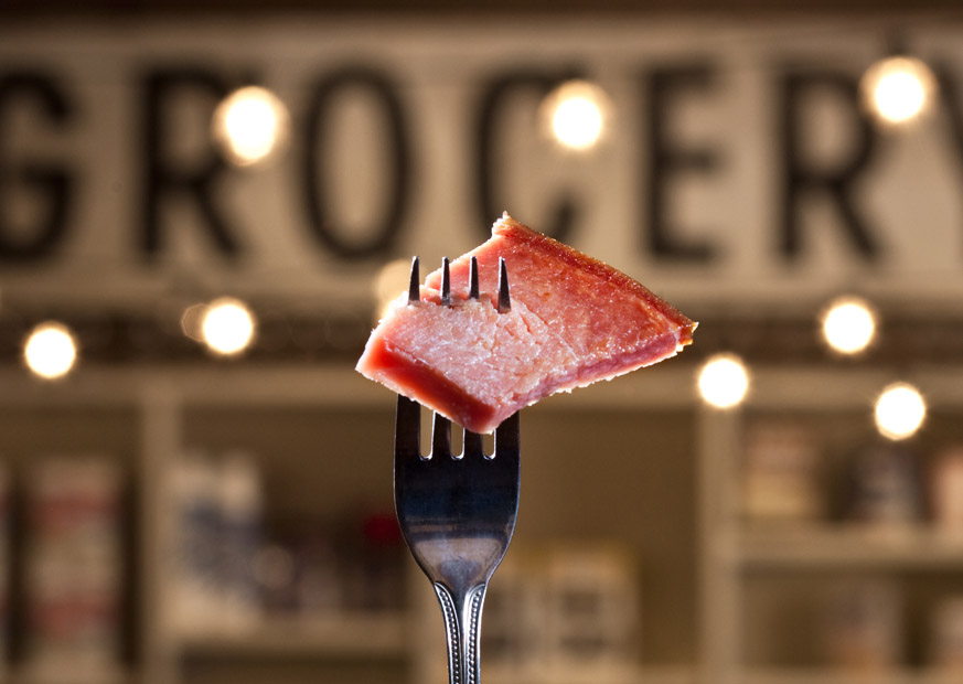
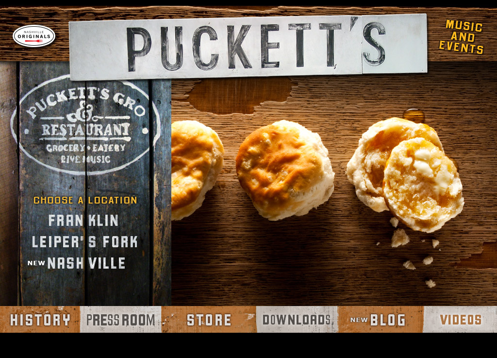
Great food photography can trigger the viewer to have a physical reaction, motivating them into action.
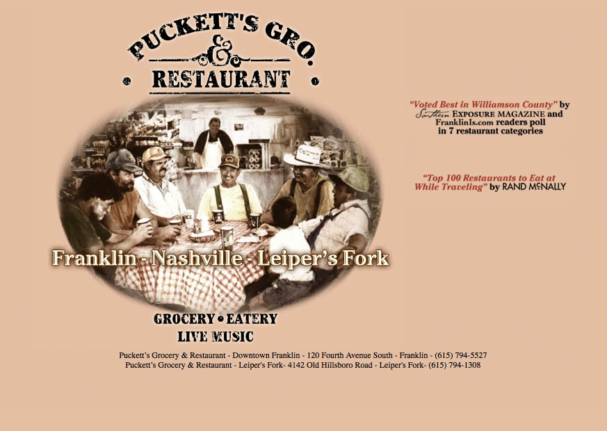
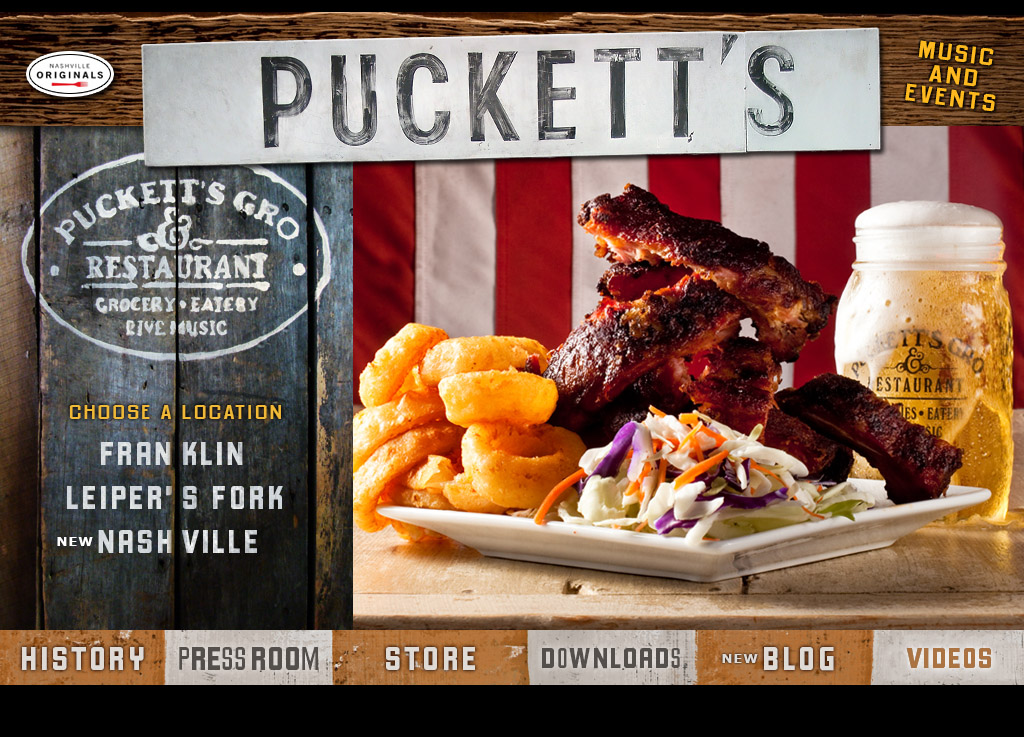
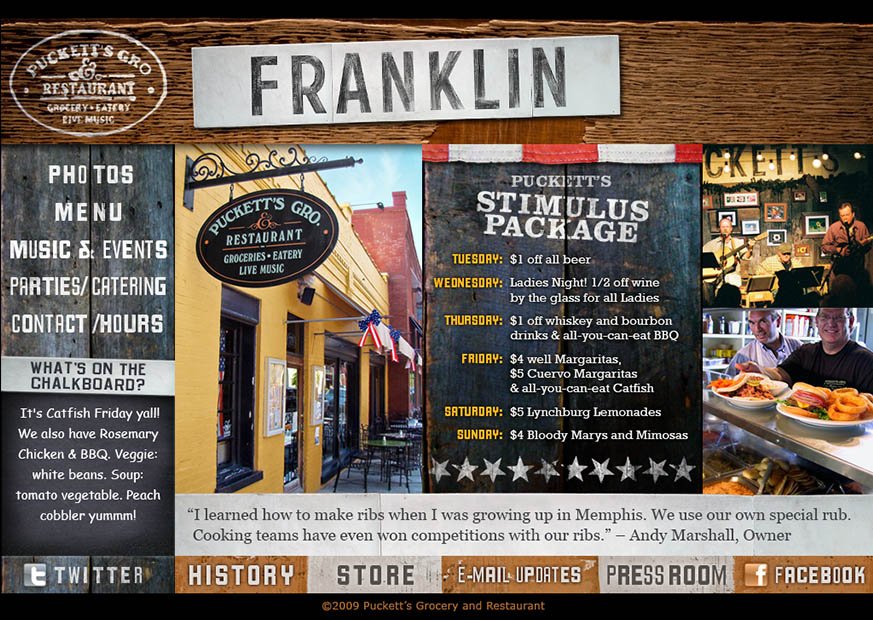
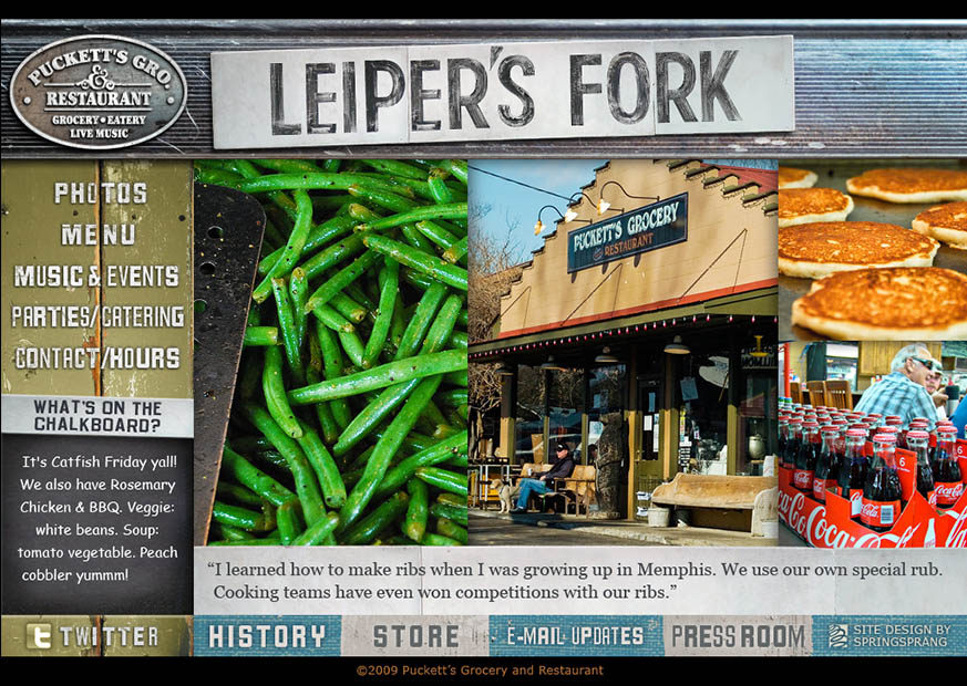
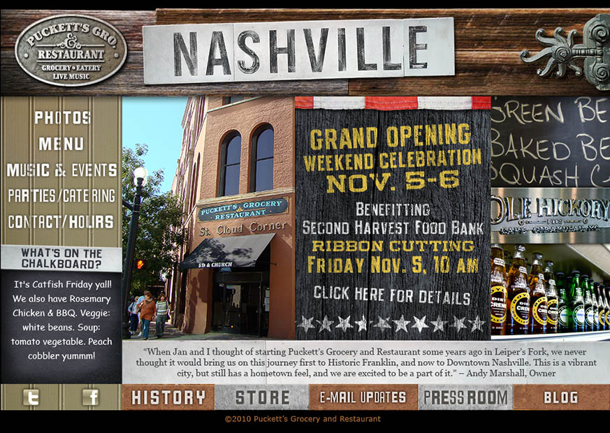
In 2009, Puckett’s owner Andy Marshall hired SpringSprang (my business at the time) to redesign the Puckett’s site in a way that better matched his vision for the business. Puckett’s is more than a restaurant, really – it’s a unique destination. So we went in with cameras blazing, capturing textures and details to establish the character of each location. Then we built a site with a framework that highlighted each location’s individuality.
The importance of great food photography
Back in the days when I was cutting my design teeth at Wencel/Hess in Chicago, I saw the effort that went into making appetizing food photography. I knew that a great food shot could trigger the viewer to have a physical reaction that would motivate them to action, and also I knew that I couldn’t do it myself. So we enlisted photographer Kyle Dreier to take some killer shots, and we prominently featured those shots on the main splash page.
Nearly every food-service client that I’ve ever worked with recoils at the price of good food photography. I totally get it, too – it’s expensive – but the payoff is exponentially greater than trying to make do without it.
With Puckett’s, the end result exceeded all of our expectations. Puckett’s was already a popular local eatery, but the site redesign put them over the top, capturing national attention. It even prompted a popular Food Network star to travel to Franklin and visit the restaurant.
The 2009 design was straight HTML, but it included a stylized Twitter feed that appeared as writing on a chalkboard with the features of the day. This was a cheap and effective way for them to keep info updated on their site everyday. In 2011 we rebuilt the site to include a full custom CMS, but maintained the look.
Success Spawns Growth
In 2012, Puckett’s expanded with a second Franklin location, serving a slightly different menu than the original, so they needed a slightly different approach. In very quick order, we launched a teaser site that played up this new approach. We also recognized by then the growing importance of having a mobile-friendly site that was easily updated, so instead of building The Boathouse site on the existing site’s framework, we made the shift to WordPress. (WordPress has come a long way in the last several years, and all the sites that I currently develop are based on it.)
Andy took a risk on spending more than he intended with his site design, but you can’t deny the results. Due to their evolving needs, their in-house team recently reworked their site, and today it is fully mobile-responsive. I take a lot of pride in what we helped Puckett’s accomplish.


